

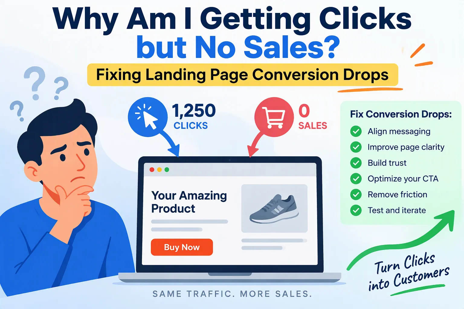
You are paying for every click. The ads are running, the dashboard shows traffic, and the sales are not there. Or they were there last month and have quietly dropped. When money leaves your account daily and nothing comes back, that is not a marketing inconvenience. It is a bottom-line emergency.
Here is the premise of this article: when a campaign delivers clicks but no sales, the ad is rarely the main problem. Your ad did its job. It got a real person to tap or click. What happens in the next few seconds, on your landing page, decides whether that click becomes revenue or a wasted cost. In my experience, the cause is almost always a disconnect on the page, and it is usually something you can measure and fix.
The Hidden Culprits Behind Conversion Drops
1. Technical performance and speed bottlenecks
Paid visitors are impatient and have no loyalty to you yet. They clicked an ad, and if the page does not respond almost immediately, they leave. A delay of two or three seconds can lose a large share of visitors before they see a single word, and your ad platform still charges you for the click.
The usual causes are rarely dramatic:
- Heavy, unoptimized images such as full-size photos or hero banners that are several megabytes.
- Too many scripts: chat widgets, tracking pixels, heatmaps, font libraries, and plugins all loading before the page becomes usable.
- Poor Core Web Vitals, especially a slow Largest Contentful Paint (the main content takes too long to appear), layout shifts (buttons jump as the page loads, so people tap the wrong thing), and slow response to taps.
- Mobile rendering bugs: text that overflows the screen, sticky bars covering the buy button, or forms that the on-screen keyboard hides.
Most ad traffic comes from phones. If you only test on your office laptop with fast Wi-Fi, you are not seeing what your customers see.
2. Message mismatch between the ad and the page
The ad promised something specific: a discount, a product, a solution to a particular problem. The visitor lands, and the page opens with a generic headline, a different offer, or the homepage. In a few seconds they ask themselves, “Am I in the right place?” If the answer is not an instant yes, they leave.
Check these three things above the fold (the part of the page visible without scrolling):
- Does the headline repeat the promise made in the ad, using the same words?
- Does the visible offer, price, or product match what the ad showed?
- Is there one obvious next step, visible on a phone screen without scrolling?
3. UX and friction points
Even a visitor who wants to buy will give up if the path is confusing. Common friction points include:
- A full navigation menu that sends visitors away from the offer
- Buttons that look clickable but do not respond, or respond slowly
- Form fields that reject valid input, such as phone numbers, postal codes, or special characters
- Pop-ups that cover the page on mobile and are hard to close
- No instant trust signals, such as reviews, recognizable payment logos, return policy, secure checkout indicators, or real contact details
People decide whether to trust a page within seconds. If it looks unfinished, they will not hand over a card number.
4. Checkout and API failures that nobody sees
This is the most expensive culprit because it is invisible. Your page looks fine and your analytics show visitors reaching checkout, yet orders do not complete. The cause is often a technical failure that gives no obvious warning:
- A payment gateway that fails silently for certain cards, countries, or browsers
- A script that crashes after a plugin or theme update, disabling the “Place order” button
- Form validation errors that never show a message, so the customer does not know what went wrong
- An integration with a CRM, shipping service, or email tool that times out and blocks the whole submission
If sales dropped suddenly, look at what changed recently: an update, a new script, a changed setting. Sudden drops almost always have a technical cause.
A Step-by-Step Framework to Fix the Funnel
Step 1: Run a technical and mobile usability audit
Start by looking at the page the way your customers do.
- Test the page with Google PageSpeed Insights and review the Core Web Vitals results, focusing on the mobile score.
- Open the page on a real mid-range phone over a regular mobile connection, not Wi-Fi.
- Test on at least two browsers and two screen sizes, including one older device.
- Go through the whole journey yourself: click the ad, land, fill the form, pay. Do it with a real card where you can, and watch for anything that fails or feels slow.
- Check the browser console for errors. A red error on a checkout page is a lead worth following.
Step 2: Verify your tracking before you blame the copy
Many businesses rewrite headlines and redesign pages when the real problem is that they cannot see what is happening. If your analytics are wrong, every decision built on them is a guess.
- Confirm that conversion events, such as purchase, form submit, and add to cart, fire exactly once, at the right moment.
- Check that your ad platform pixels and your analytics agree. A big gap between the numbers is a warning sign.
- Make a test purchase or submission and watch it appear in your reports.
- Make sure consent banners are not blocking tracking for everyone, or firing events before consent where that is not allowed.
Fix measurement first. Then you can trust what the data says.
Step 3: Simplify the conversion path
Every extra element on the page gives the visitor another reason to leave. Remove what does not help them buy.
- Cut form fields to the minimum you need to complete the sale or follow up. If you do not use a piece of information, do not ask for it.
- Remove secondary links and the main navigation from paid landing pages.
- Keep one goal per page. One offer, one call to action, repeated clearly.
- Show trust near the action: reviews, guarantees, and payment logos beside the button, not buried in the footer.
- Make errors helpful. If a field is wrong, say which one and why, in plain language.
Step 4: Optimize loading performance and the critical rendering path
Once the funnel is clear and measured, make it fast. The goal is for the visible part of the page to appear as quickly as possible.
- Compress images and use modern formats, and size them for the screens that load them.
- Load only what the page needs to display first. Delay chat widgets, heatmaps, and other non-essential scripts until after the main content.
- Reduce or remove plugins and third-party scripts that are not earning their place.
- Reserve space for images and banners so the layout does not jump while loading.
- Use caching and a content delivery network so the page loads quickly for visitors wherever they are.
Then retest. Speed work is only finished when the numbers prove it.
A Low-Converting Page Is a Solvable Problem
If your clicks are not turning into sales, you do not need a bigger budget or a new ad strategy yet. You need to find where the funnel leaks. A low-converting landing page is an engineering and design puzzle, and puzzles can be solved methodically: measure, find the failure, fix it, and test again.
Many of these problems, including slow pages, broken tracking, and silent checkout errors, can be found within days once someone looks at the right places. Every day you wait, you pay for traffic that cannot convert.
Get your landing page and funnel audited
I audit landing pages, technical performance, and conversion funnels for businesses running paid traffic. I check speed, mobile usability, tracking accuracy, and checkout reliability, then give you a clear, prioritized list of what to fix to get your ad spend working again.
Contact me for a landing page and conversion funnel audit and let’s find out where your sales are going.
